


Musical Malaise, By Design
The streamers are needlessly hindering the journey.
Nearly every service we use and touch on the internet has changed dramatically over the past ten years, not always for the better of course, but pick a platform, and you’ll see a steady march of new features and refinements with at least some gesture toward better serving the user. One weird exception: the streaming music apps, which look and feel largely as they did in 2010 and largely like each other. Most critiques of streaming focus on the money and how little of it trickles down to creators, and that’s a valid concern. But a deeper, more corrosive issue is right under our fingertips and eyeballs, threatening those same music makers long term by stifling music appreciation itself. This problem gets too little attention, while it quietly and relentlessly damages our collective musicality. I’m talking about bad design.
“Design is one of the most powerful forces in our lives, whether or not we are aware of it,” says Alice Rawsthorn in a conversation about her book Hello World: Where Design Meets Life. “Design should always be in the service of a better life, but, unfortunately, it does not always achieve that objective.” That sounds wonky, but her argument is pretty incredible. She’s saying that while design is often understood as the look or shape of something, it’s also intrinsic to the perception, usability, success and endurance of the thing itself, whether that’s a public plaza, a hand tool, a work chair, a cruise ship or a news magazine. Bad design can be merely esthetically unfortunate (and it so often is), but it can also damage the environment, shorten our lives, deprive people of opportunity and even, as we’ve learned to our grave dismay, undermine democracy. When we think about the nexus between a human being and a medium or art form, we have to drill down into the subtle but powerful cues that can either enable or inhibit apprehension, comprehension and affection for the subject at the other end of the exchange. Design teaches, in spans of milliseconds, minutes, hours and years, and if it’s a bad or deceptive teacher, users are disabled or deceived in ways they’ll never know.
In just about a decade, app-based digital service provider companies, chiefly Spotify and Apple Music, have become the portal through which nearly everyone has primary contact with the universe of recorded music. Streamers didn’t just unseat CDs and tapes. They replaced legacy modes of music discovery, acquisition and engagement that ushered generations into music fandom. That ecosystem includes but is not limited to: radio stations, record stores, record packaging, liner notes, music gifting and music collecting. Those aspects of the analog era music ecosystem carried signals, rewards and limits, all of which enhanced or inhibited the musical journey. Even scarcity, the inability to get what you want right now, imparted value to the fan-music dynamic. Now we use screens and apps to access a musical cloud, and that interface point guides us, through intermittent rewards and obstacles, to our thinking about the art at an unconscious level. My argument is that the streaming music platforms are designed to promote passive consumption while discouraging engagement, enlightenment and growth.
As millions and millions of people, particularly young people, click and swipe through galaxies of content in their music apps, they’re being taught not how to access music but rather what music actually is, and they’re getting an alarmingly shallow impression. Some aspects of DSP design are so bad that I’m convinced that countless people who might have been drawn into rich lives in music, as fans if not as musicians, will simply never get excited about it and will default to complacency which, as I’ve observed, is pretty hard to shake once its ingrained.
I’m all too aware that a man kvetching about this or that feature being hard to find or this or that button being in the wrong place gets tiresome really fast. I won’t get too in the weeds, though I must cite some examples to make my case. My aim is more about shaking up the conversation about how the streamers handle the art and science of User Interface and User Experience, known in the biz as UI/UX, because here is the nexus where the music consumer will or won’t become a music fan (or a musician) in our current era.
(My critique focuses on the desktop/laptop apps of the major streamers and in some cases the tablet experience. I understand that the vast majority of streaming music is accessed through smartphones. And fine, I use Spotify on my phone too. But I absolutely insist that the connect-the-dots journey of musical discovery and collection-building so crucial to deep understanding and fandom, is going to be vastly more difficult and vastly less inspiring on a small screen.)
DISPLAY AND PLAYBACK
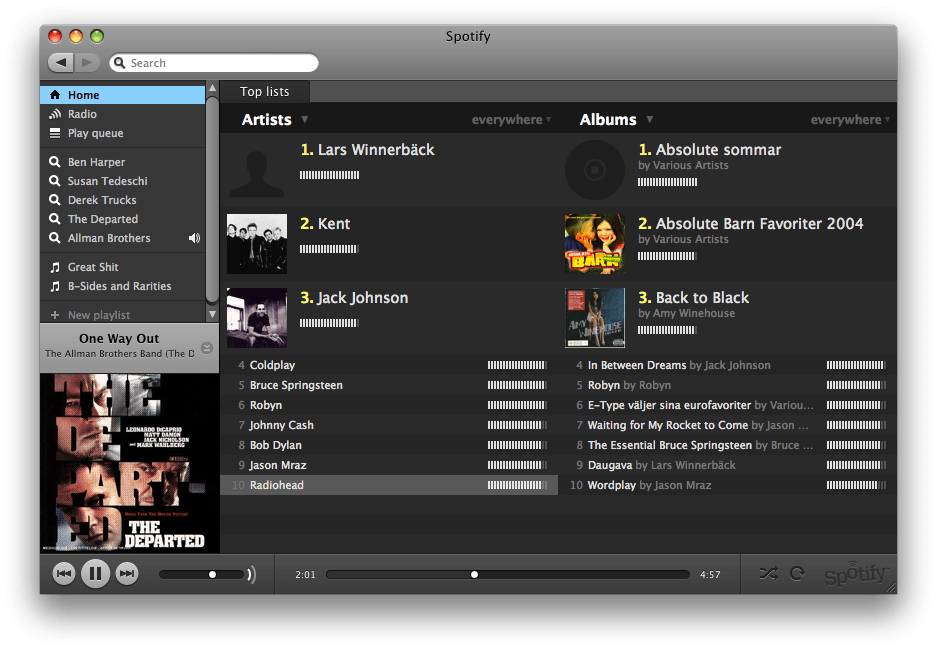
Here’s Spotify’s interface. What do you see?

The eye lands first on Dark River, which my brain tells me is probably a song title. But I’m wrong; it’s the album in this privileged position. Now I’m all for celebrating the album, but at the moment of playback, I’d argue that the track title and the artist are a good deal more relevant. It takes some looking to determine which of the album tracks is actually playing. It’s highlighted in green in the track list, Spotify actually names the track down and to the left in minuscule type. And the artist? Her name is in 10-point type, which isn’t so bad if you’re already a fan, but as we browse and discover new artists, we want those names prominent, so they can sink into our memory. Compounding the problem are two similarly sized album covers, which vie for attention rather than drawing the eye. In the end, artist, album and track are all diminished, despite a huge void of blank space in the window.
Also notice the position and proportion of the playback section of the interface. Friends and neighbors, we have come to this application to play music, to select tracks and to let them unfold in time. In this exchange, playback is the main event and should be treated as such. Yet the graphic representing playback is buried at the bottom of the screen, which is the last place your eye wants to go on a computer. Playback is also slimmed down by some pretentious designer trying to make it disappear, for some insane reason. Must I remind these anonymous, impossible-to-reach designers that in jet fighters or luxury cars, critical status information is presented on a heads-up display? Again, that’s UP. Is Spotify ashamed of this 3:14 of time or the controls that allow us to pause, play, shuffle, rewind or skip tracks? We don’t put our turntable inside a closet. Even CD players have prominent track and time information on the front of the box, not the side or the back. Well-designed audio components make their controls easy to see and critically, tempting to touch. Spotify and Tidal, to name the two streamers I’m most familiar with, exile playback to the basement of the display, and thus the act of “spinning” a song, to a situational/ psychological backwater.
I have not yet seen the ideal playback/album display, but it would look a lot more like these two examples, first from the Internet Archive’s audio library and then from the extremely popular service Soundcloud.
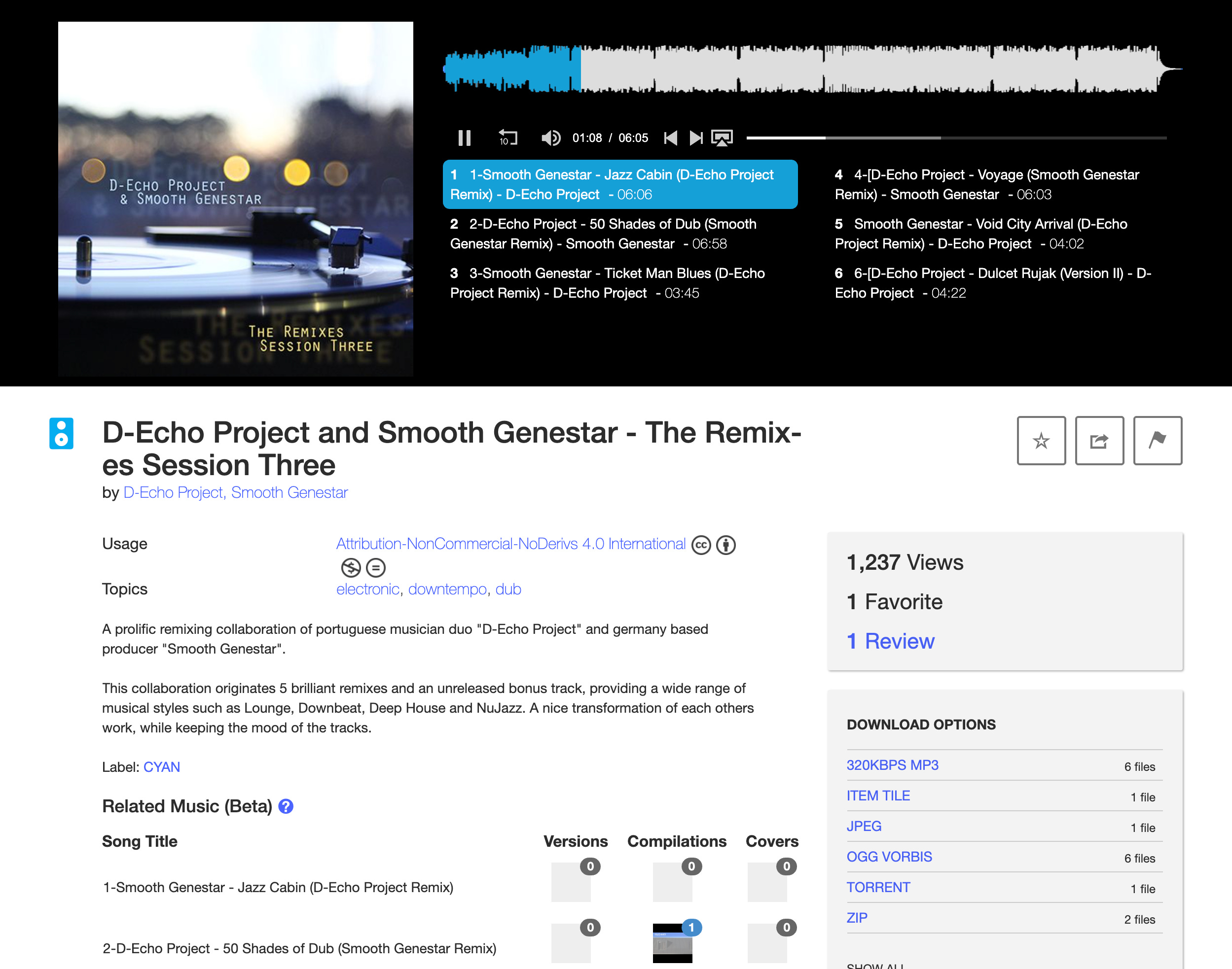
I’m not going to argue that the the Internet Archive’s interface is more esthetically graceful than Spotify. But it certainly pays more respect to the track, the artist, and the listener. Playback is at eye level, center stage if you will. The track is highlighted and easy to see. The play/pause button is sensibly placed at the beginning of a list of less important functions. The album art is focused and large enough.
But the most important design element here is the waveform. Soundcloud also has a heads-up playback display with a modified, stylized waveform. (Soundcloud used to display an authentic waveform, and its decision to drop it for this abstract mush was a terrible mistake, and I will always wonder why they did that.)

I can’t emphasize enough what streaming music misses by overlooking the waveform as a visual guide to music playback. These shapes are deeply familiar (even comforting) to those of us who work in professional audio production. Most people have had glimpses of them but haven’t been given the chance to take advantage of their potential for what I’ll call oriented listening. What’s the track duration? Am I on a quick pop song journey or an extended improvisational journey or a classical movement journey with many passages? Waveforms also orient us in the realm of dynamic range, which is important to a rich, rewarding musical experience. Before a track starts, I can tell if it’s an over-compressed wall of monotonous volume or if the work is going to take me up and down a bit. If it’s classical music (generally the most dynamic genre) we’ll be able to survey and anticipate the flow of quiet and titanic passages. You can ignore this information if you like of course, but having a sense of structure, form, dynamics and duration is grounding and emotionally reassuring.
To be clear, an audio waveform is a graphic representation of how loud the track is across time. Here’s the waveform for the famous Miles Davis track So What?
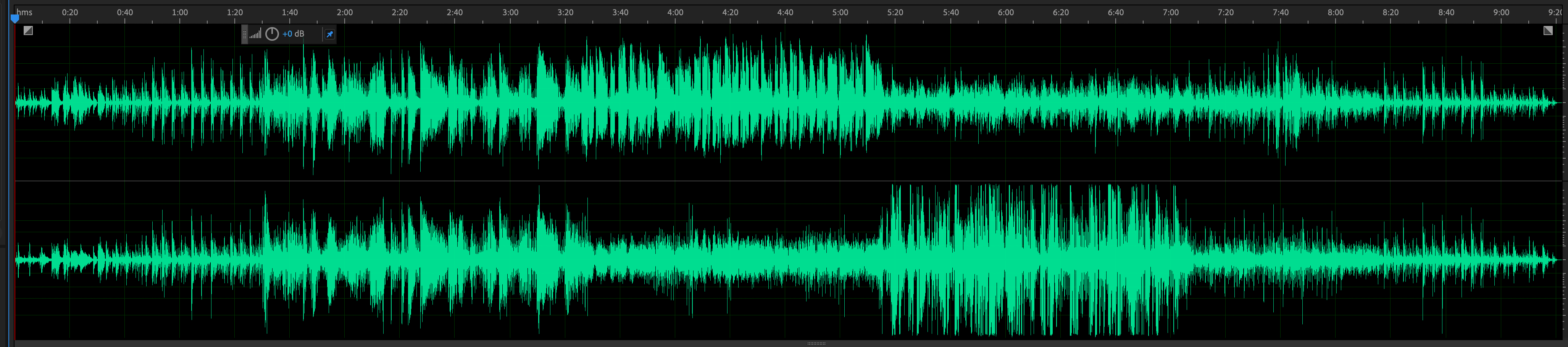
With a quick glance we can know that the track is 9 minutes long and we can see that it has robust dynamic range. It’s going to start quietly, with a bolder middle section where the solos happen. Because this is a stereo waveform and not a mono waveform (as in the examples above), we can even see where the solos begin and end, plus where they will “appear” in the stereo sound stage. If I designed a streaming app, I’d offer a button that could toggle the view from stereo to mono to a simple progress bar. It ought to be an option, and the height of the window should be drag adjustable.
This graphic depiction of the music in time takes advantage of the way humans experience and process music, rooted in the unconscious experience of anticipation and reward. Neuroscience has established that one of the reasons we love music is its manipulation of this set of hard wired routines in our sub-cognitive mind, where we build up a craving for certain kinds of harmonic and rhythmic resolutions (cadences). Composers and musicians set us up, tease us and deliver payoffs. Waveforms don’t let us see harmonic changes or resolutions, but they do show us the dynamics of a work in time. It helps make the duration of a work more mapped out and comprehensible. An oriented listener is more likely to stick with challenging music and develop modes of listening to a wider range of sounds.
There’s one final note I’d like to make to close out this section. It’s a playback detail that one streamer gets very right while the rest get it wrong, and it’s revealing as we think about these things from a psychological standpoint. When I hit Play or Pause in Spotify, the track does a quick fade in or fade out. In iTunes or Tidal, Play and Pause cause the music to start or stop suddenly, often with a sharp digital click. Somehow, Spotify understood that if sound is jarring to the brain (we are especially sensitive to sudden sonic changes) it is subconsciously less appealing. Spotify’s gentle stop and start creates a more comforting and even tangible relationship with the sound. It’s the kind of tiny decision that impacts the user base billions of times per day. People might say they don’t care, but that’s what they think. Music design has to put impression and emotion first.
COLLECTING
Now have a look at the Albums view of Tidal, the streaming service I now use day to day. It displays the covers in a grid that looks very much like the default view established by iTunes upon its release twenty (!) years ago. The tile grid is one fine option for viewing albums, but I hasten to observe that iTunes used to have multiple ways of viewing albums, including “cover flow.” Remember cover flow? You could drag back and forth and the covers would flip by like a smooth jukebox or an evocation of flipping through albums in a bin. It was good for rapid browsing, much better than scrolling tediously through the grid, which in a music fan’s case might well include more than 5,000 titles. A closely related feature iTunes offered for years before it was also mysteriously dropped was a zoom bar to make your album covers larger or smaller. The avid fan who wanted to scan a large collection could zoom the covers down to thumbnail size so that more than 100 could be seen at a time. Once again, as with waveforms, features appealing to the avid, active music fan were discontinued. The apps, like Tidal’s, were left standardized, inflexible and geared toward the user who didn’t care much about scanning his own collection. And that brings me to an even greater flaw.

Notice that here in Tidal, there’s one - and only one - view of the Albums collection. From my point of view, this is the most important and frequently visited zone of my streaming service, the heart of what makes it mine. It’s also the zone that evokes and recreates the core dynamic of my life as a music fan, which is selecting and acquiring albums. And yet, the app’s albums collection actually bears little resemblance to my album collection at home. Why? Because my album collection at home isn’t in one big amorphous group sitting rigidly on one shelf. Any music fan’s physical album collection is going to be in constant motion, with some titles out and in view while other are in long-term storage. Even more significantly, those albums will be subdivided into groups. I look around my studio and there’s a stack of new albums not yet listened to, a tray of CDs from this year so far, another tray with the ones I love from this year and want to keep cloistered, etc. Then there are my big genre groups, shelves for American popular and roots music, another section for jazz, another for classical, another for anthologies, etc. None of this sub-dividing is possible on the major streaming services.
What we do have to work with are playlists. And let me say that playlists are a truly fantastic feature. Playlists on the big streamers all work about the same, with drag and drop ease. I use playlists and take advantage of others’ playlists. But here’s the thing. Since iTunes gave us playlists, they’ve been oriented to single songs and not albums. Speaking about Spotify and Tidal now, if I put albums in a playlist, they show up as 10-13 individual songs on a spreadsheet and you can’t view them by album cover. So any attempt to make 2021 Jazz” fails. A deeply ingrained behavior of a serious music fan is stymied by software, and the instinct/inclination of a new music fan is stymied as well.
There is one streaming service that has, after years of hoping, given me the tools to sub-group my albums into collections, so I can group and browse by era, theme or whatever I want. That service is Roon, a private company whose software wraps around Tidal or Qobuz, the two major high-resolution streaming services. When I use Roon, I am playing my Tidal subscription through the Roon app, which I can operate on my desktop, phone or iPad, where it is especially elegant and useful. There is a lot to say about Roon, and I’m going to write a complete review soon, but to close out this segment, I’ll say that Roon achieves my goal by letting me tag albums with ease. I have a tag called Nu-Jazz, which is my sub-collection of modern improvised music that I wish to see on its own “shelf.” I can look at “2021 Roots” or “grass” (and whether that’s stoner music or bluegrass I’ll let you guess) with a tap and then sort that album list by date added, release date or artist name. Again, it’s my collection, just like my physical collection, and I have a right to sort and view it as I wish. It’s quite hard to understand why Spotify, Tidal and Apple haven’t figured this out.
DISCOVERY/EDUCATION
As I pointed out earlier, album covers in most of the streamer environments are small, even smaller than CDs, whereas album art flourished on the 12.3 inch-square LP sleeve. Click an album cover in Spotify and what happens? Nothing. Click an album cover in Tidal however, and this happens:
Now that’s more like it! I love this cover and thank you Tidal for letting me view it almost album size on my 4K display. It enhances my experience and gives me something to do while I’m listening, something oft said about LP covers and CD booklets. And here we arrive at perhaps the most intellectually stunting aspect of the streaming services, which is that as an environment to savor the full album experience or to learn about the recording and its personnel, the streamers are graves disappointments. As I’ve argued before, these information-poor environments don’t just hinder users from connecting dots between works, musicians, labels, eras or genres. They may leave the newcomer unaware there are dots to connect. Not everybody read LP or CD liner notes back in their heyday, but their presence offered a standing invitation to the listener, whispering ‘there’s much more here to learn.’ Those who took advantage became the super-fans and influencers that music so badly needs to keep advancing.
This is a sprawling topic worthy of books and careers, so I have to be selective here about where streaming service UI/UX needs to go to encourage musical exploration, growth and knowledge. If I were the boss, to start, I’d task a team of musicologists, designers and volunteer users to build out museum-like views of the catalogs/careers of 1,000 historic artists. Home pages for David Bowie, Miles Davis and Loretta Lynn for example would show albums grouped by era with star ratings and notes for the most important releases. Artist bios would link to those albums in their text, likewise to key collaborators and producers, giving the listener a way to explore branches off the main stem and make associations (‘Hey, Owen Bradley produced Loretta Lynn and Patsy Cline!’). Meanwhile on the standard artist landing pages, I’d be sure to have the artists’ official web site, Wikipedia and AllMusic pages one click away and easy to see. I’d have an image search button for the artists, because people like to know what artists look like. This stuff all exists on the wider web of course, but we’re trying to lower barriers to exploring, and putting key content partners inside the streaming app is the bare minimum to inviting users to learn while they listen. I’ll give credit where due and say that Spotify has made upgrades in recent years to its artist pages, with bio info and important sections such as “Appears On,” “Credits,” “Fans Also Like” and “Influencers.” Tidal does less well, though the Roon overlay fills in many of Tidal’s blind spots.
Perhaps the core obstacle to an info-rich streaming environment is a problem that’s not entirely the streamers’ fault, and that’s the poor state of the recording industry’s metadata in general. Metadata is the invisible “about” information that can and sometimes does travel along with a track, including composers, performers, producers and engineers. Despite a decade of working groups, standard-setting, artificial intelligence solutions and the plight of artists who aren’t getting paid what they’re owed, this problem persists. A couple years ago, The Verge called music metadata “important, complex and broken,” and I don’t detect much forward progress. I’d stress that credits data is not absent from my streaming world in Tidal and Roon, just that it’s wildly inconsistent. Soon after I started test-driving Tidal in 2020 I was enjoying the debut album by jazz supergroup Artemis and when I tapped “credits” a window appeared that made me gasp out loud in happy surprise.
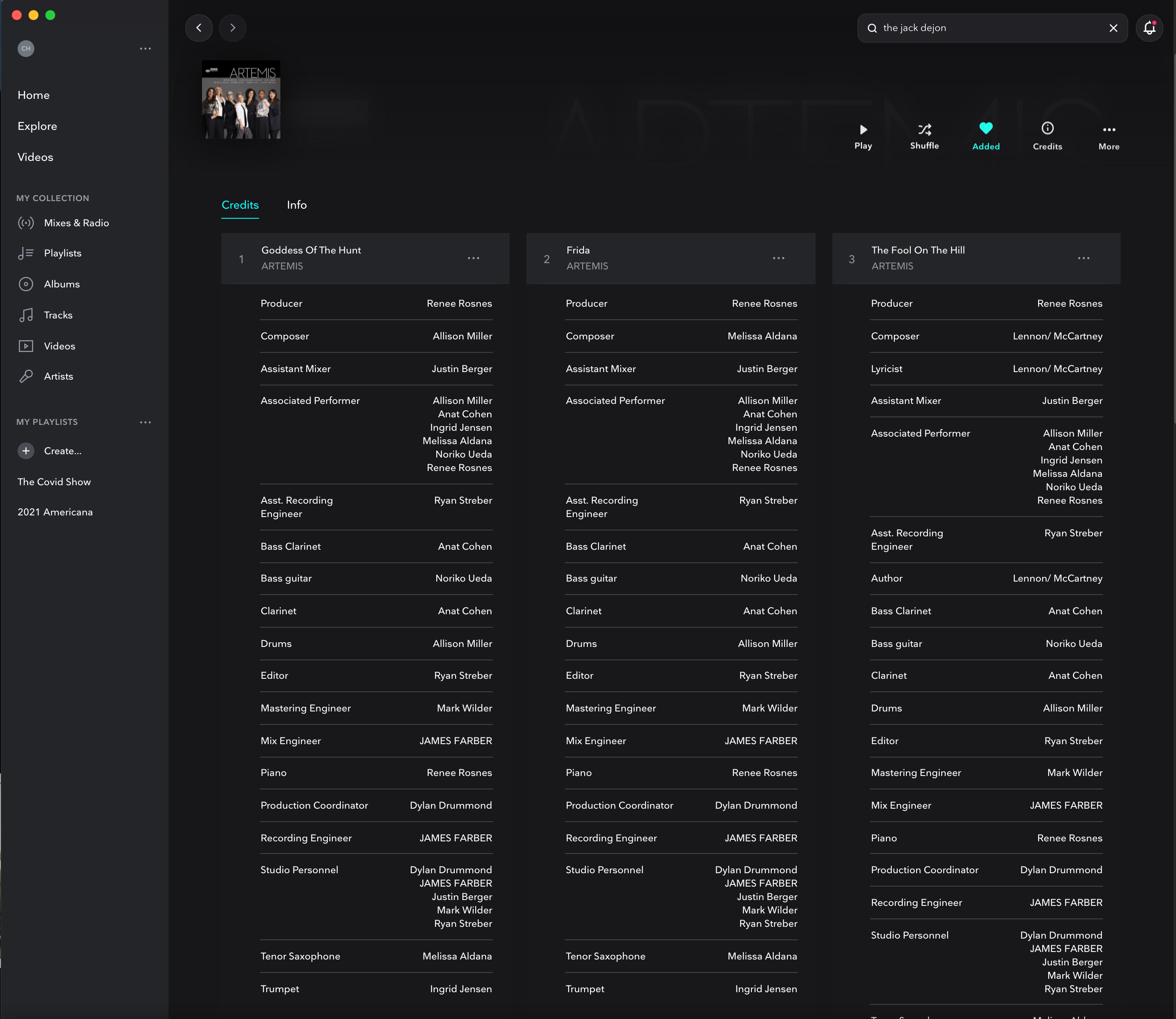
Every track had performers by instrument and recording studio credits. Critically, each track had its composer visible in the master credits list, while Spotify requires two clicks on each track. On an album like this one, with seven marquee artists each with her own vision, knowing each track’s composer colors how I hear it (and write about it). And each of those names up there is a link, so I spent quite some time browsing the catalogs of the women who were new to me through this recording. The system worked in this case, but it’s wildly inconsistent. I find well-regarded albums all the time with not a stitch of credit data baked in. I see new albums being uploaded into the system through syndicators like TuneCore and CD Baby that may or may not have full performer/producer credits. This can be the fault of the indie artist who uploaded the music without filling in all the blanks and sometimes the syndicators themselves, which lack the blanks to fill in. And once again, this is not academic or the province of geeks only. An indie artist friend of mine recently serviced his latest album to the services and was unable to include the fact that his personnel included a major-league L.A. drummer and some top-flight Nashville acoustic musicians. Were those credits included, the services’ algorithms might well make my friend’s album more visible to fans of those musicians. We can’t build this rich information/connection tapestry if there’s not an industry-wide solution to how we attach credits and liner notes to every distributed album, from the famous to the obscure.
If you’ve made it this far, congratulations and thank you for taking this subject seriously. Music user interface design is a backwater of a backwater of the music conversation in 2021, because it’s seen as superficial. But it’s not. It has a deep and enervating effect on the music enthusiasm of the digital music consumer, which is to say nearly everybody on the planet. Of course you or I can outsmart the design flaws and press on past the weak spots and listen to what we want when we want. We can look up artists and albums on AllMusic.com or Wikipedia. We can build workarounds to “collect” albums. But I am steeped in this stuff and especially determined to have a deep and personal experience with my music listening. What about the millions of less motivated, less aware, newly on-boarded listeners? I fear that they don’t know what they don’t know and that too much of the streaming experience stunts their growth and their music collecting skills, when its first job ought to be the opposite.
There ya go distracting me with wildly intelligent and thoughtful writing. Someone with a boatload of money needs to hire you to advise and supervise the design room. Thank you for the emphasis on discovery as an essential component to true music appreciation.